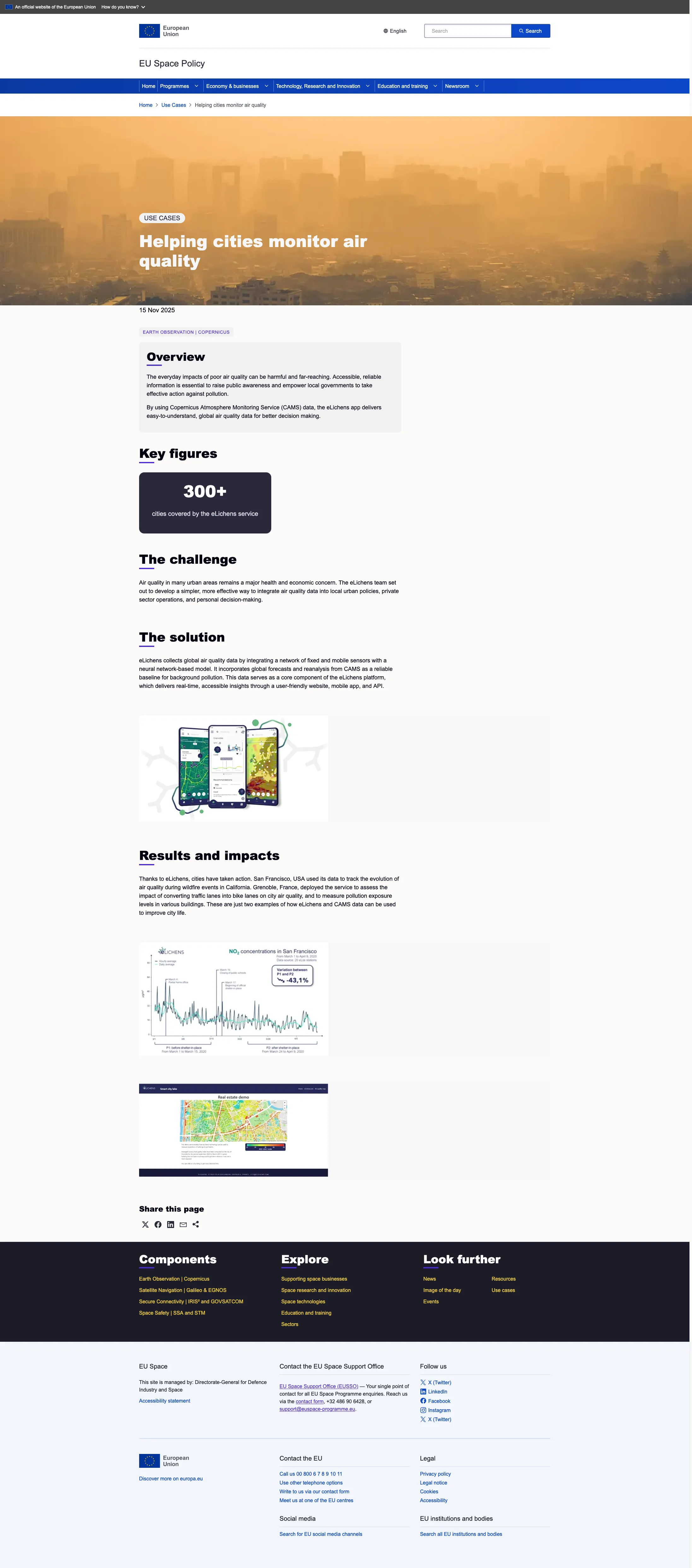
Use cases content type
version 0.1 Read time 5m 30s
Use the Use Cases content type to tell a structured story about a real-world problem, the EU Space–powered solution, and the measurable outcome. Each page has dedicated Overview, Challenge, Solution, and Results and impacts sections rather than one free-form body.
Each section is built from a limited selection of reusable content blocks, such as Structured Content Section, Media Content Section, or Key Metrics Row. Add the appropriate block inside the section instead of typing directly into the section field.
Step-by-step: write a use case
1. Open the add form
Dashboard → + Add content → Use cases.
2. Header section
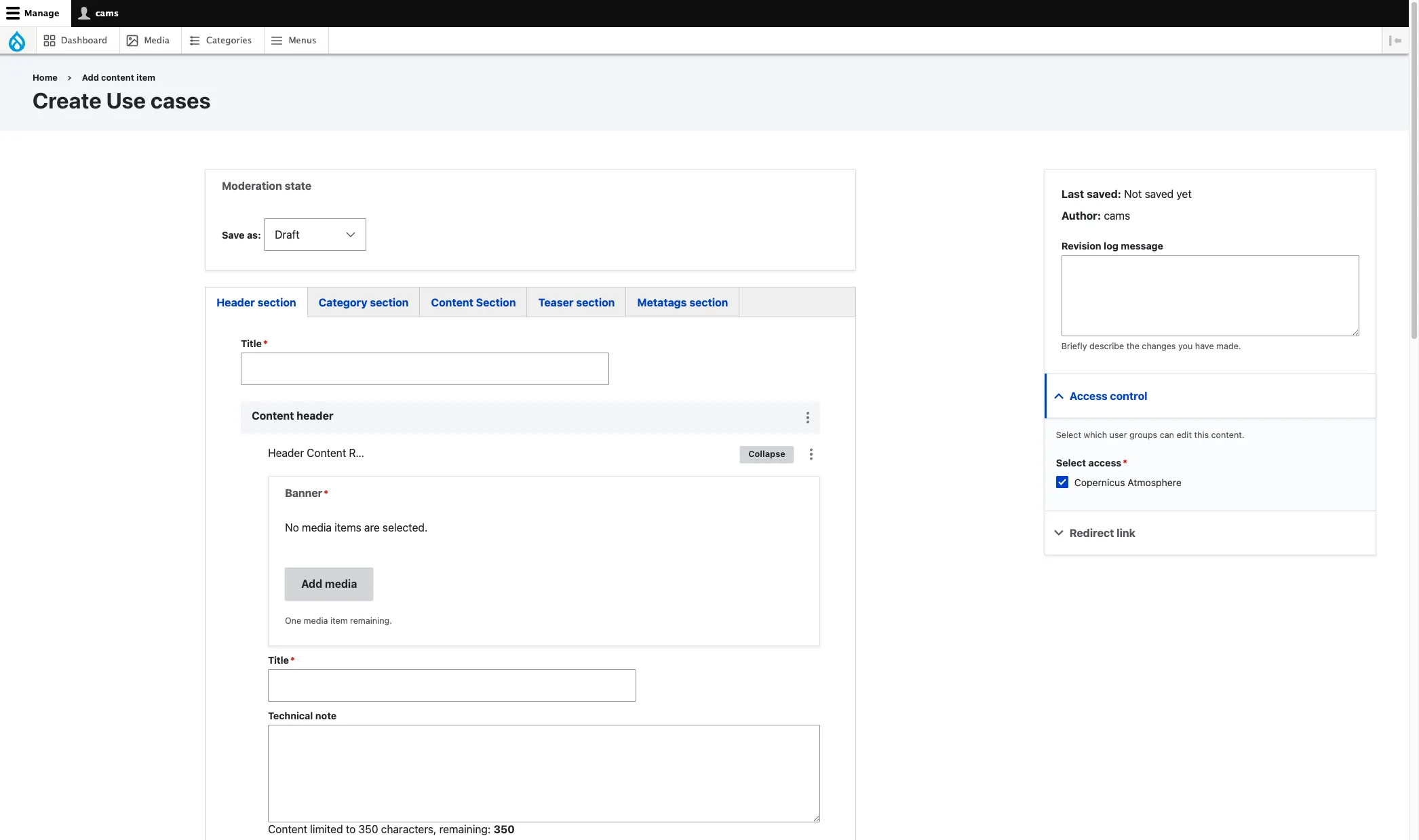
Default open tab. Fill:
- Title (required) — the page’s internal name and the basis for URL generation. It is rendered as the page H1 when no Header Content Row is present. When a Header Content Row is used, that row’s Title becomes the visible H1 instead.
- Content header (optional but expected) — select Add Header Content Row for a standard banner header, or open List additional actions and select Add Structured Content with Media for a text-and-media opening. See Header Content Row for the banner walkthrough.
3. Category section — taxonomies
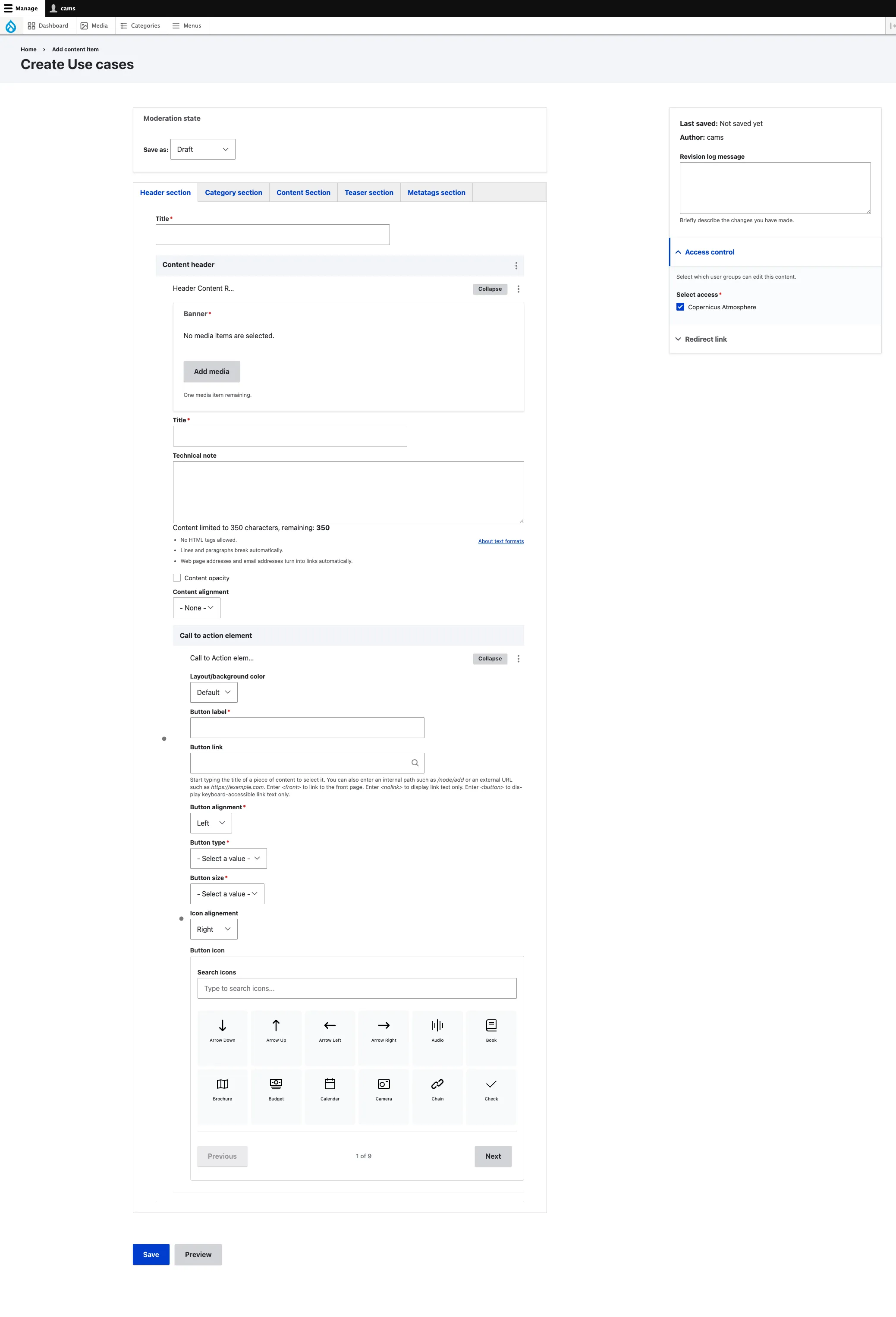
- Component (required) — programme component.
- Service (optional) — pick the EU Space service this concerns. Drives the service-accent colour and the service-scoped listings.
- Sector (optional).
4. Content Section — the four narrative blocks
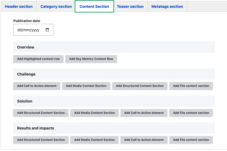
This is the heart of a use case. The Content tab begins with the publication date, followed by four sections that appear in a fixed order: Overview → Challenge → Solution → Results and impacts. Each section accepts only the content block types appropriate for that part of the story.
- Publication date (optional) — when the use case is dated. Drives sort order in listings and the dateline shown on the page.
Overview — the elevator pitch
Restricted to two visual, skim-readable bundles. No long-form narrative here.
- Add Highlighted content row — single short headline with optional supporting line. See Highlighted content.
- Add Key Metrics Content Row — one or more headline figures that summarise the outcome. See Key metrics row.
Recommendation: This block is meant to land the value in under five seconds.
Challenge — the problem the use case addresses
Available bundles (same four as Solution and Results and impacts):
- Add Structured Content Section — heading + rich text + optional CTA. The main narrative bundle. See Structured content section.
- Add Media Content Section — image or video framing the problem. See Media content section.
- Add Call to Action element — link out to a related page or external resource. See Call to action.
- Add File content section — downloadable brief or report. See File content section.
Recommendation: one Structured Content Section. Add a Media Content Section if a visual makes the problem clearer.
Solution — how EU Space data / services solved it
Same four bundles as Challenge: Structured Content Section, Media Content Section, Call to Action element, File content section.
Recommendation: one or two Structured Content Sections interleaved with Media Content Sections to walk through the workflow. This is usually the longest of the four blocks.
Results and impacts — the measurable outcome
Same four bundles as Challenge and Solution: Structured Content Section, Media Content Section, Call to Action element, File content section.
Recommendation: one short Structured Content Section stating the impact in plain language, plus a Media Content Section or File content section for supporting evidence (chart, screenshot, report).
Note — the headline numbers belong in the Overview (Key Metrics Content Row), not here. Results and impacts is for the explanation and evidence behind those numbers.
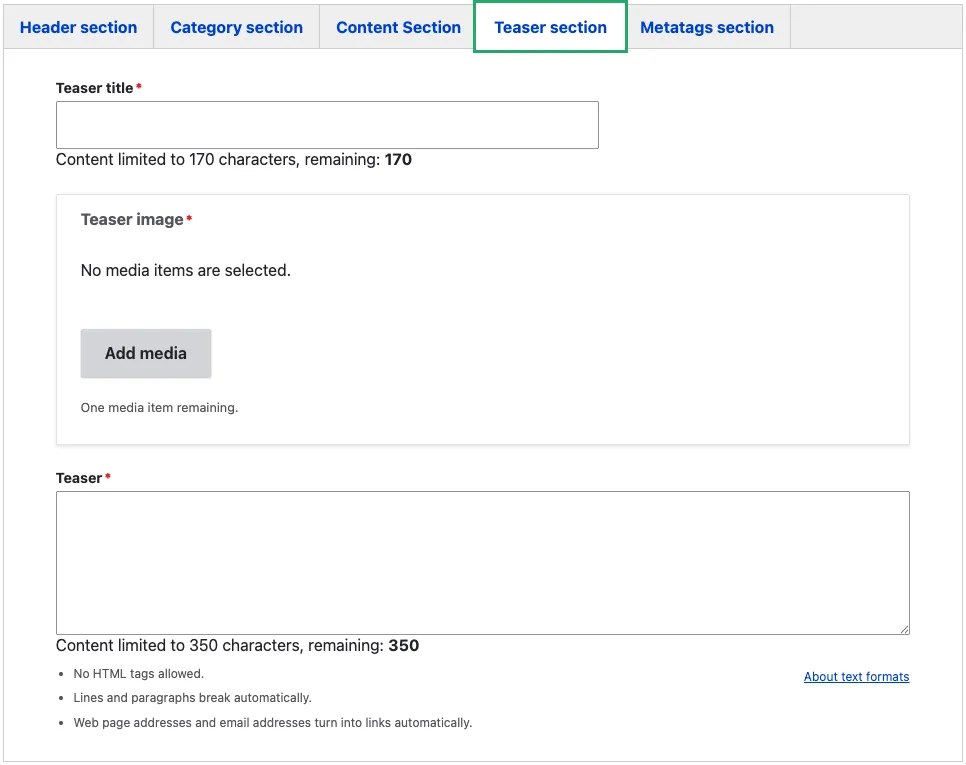
5. Teaser section
These fields drive how the page appears in listings and search results:
- Teaser title (required) — short title used on cards. Often the same as the page title; override only when the page title is too long for a card.
- Teaser image (required) — the card thumbnail. 16:9 minimum 1200×675.
- Teaser (required, plain text) — the short description shown under the title in cards.
6. Metatags section
Override the SEO defaults if needed. See Metadata options.
7. Sidebar
The sidebar on the right-hand side of the edit form contains the following fields:
-
Revision log message — briefly describe what you changed in this edit. This is visible in the revision history and helps other editors understand what was updated and why.
-
Access control (required) — select the organisation that owns this content. Only editors belonging to the selected organisation can edit or publish the page. In the example above, “Copernicus Atmosphere” is selected, meaning only CAMS editors can modify this article.
-
Redirect link — use this when the use case is documented on an external site and you want the listing card to link there instead of rendering a page on eu-space. Enter an external URL or start typing an internal page title. When set, visitors who click the card in a use cases listing are taken directly to the linked destination. Leave empty for standard use cases hosted on the platform. The mandatory teaser fields (title, text, image) must still be filled so the card displays correctly in listings.
Common mistakes
- Treating the four sections as plain-text fields. Select an Add… button inside each section to insert an allowed content block. You cannot type directly into the section itself.
- Trying to add a Structured Content Section to Overview. Overview only allows Highlighted content row and Key Metrics Content Row. If you need narrative text, it belongs in Challenge or Solution.
- Skipping the narrative arc. The four blocks exist for a reason. If you put everything in Results and impacts and leave the others empty, the front-end template renders with empty section headings — confusing for visitors.
- Long Overview. This is the elevator pitch — one Highlighted content row or one Key Metrics Content Row, not a wall of text.
- Putting the headline numbers in Results and impacts. The Key Metrics Content Row lives in Overview. Results and impacts is for the supporting explanation and evidence.
Recommended composition
- Overview — one Highlighted content row or one Key Metrics Content Row.
- Challenge — one Structured Content Section, optionally followed by one Media Content Section.
- Solution — one or two Structured Content Sections interleaved with one or two Media Content Sections to show the workflow.
- Results and impacts — one Structured Content Section explaining the outcome, plus one Media Content Section or File content section as evidence.
Tips
- Lead the Overview Highlighted content row with one sentence following the formula: “<Who> achieved <what outcome> using <which EU Space data / service>.”
- Use the Key Metrics Content Row in Overview to surface the headline numbers — visitors skim use cases looking for the “98% faster”, “30% cheaper” punchline.
- In Solution, alternate Structured Content Section and Media Content Section so each step has both a description and a visual.
- In Results and impacts, attach the source (report, chart, methodology note) as a File content section — this is what gives the numbers in Overview their credibility.
Use case example