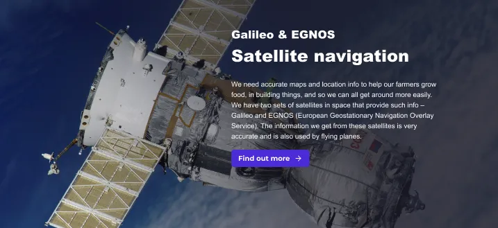
Hero content section
version 0.1 Read time 5m 06s
Purpose
The Hero content section is a visual block placed inside the body of a page — typically used to break up a long page with a section that needs to stand out, or to introduce a major sub-topic with its own image and short statement.
It is not the page banner. The page banner — the full-width image at the very top of a page — is a different component, the Header content row, and lives in a different field. Use the Hero content section when a section deeper in the page needs the same visual weight as a banner but without taking over the top of the page.
The Hero is added under the Content Section tab in the body stack of a page (the Content items field). It can also appear inside the optional section fields on Use case pages (Challenge, Solution, Overview).
When to use
Use the Hero content section when:
- A page is long and needs a visual reset between major sections.
- A sub-topic deserves its own image + statement before its supporting content.
- You want to introduce a chapter with a banner-style heading without making it the page banner.
Do not use it when:
- You only need the top-of-page banner — use the Header content row instead.
- The section is purely textual — a Structured content section is lighter and faster to scan.
Steps
1. Open the Content Section tab
On the page-editing form, select the Content Section tab. You will see Content items, the ordered collection of blocks that forms the page body.
2. Add a Hero content section
Click List additional actions at the bottom of Content items and pick Add Hero Content Section. Position it where you want it in the stack — Heroes can sit anywhere in the body, not only at the top.
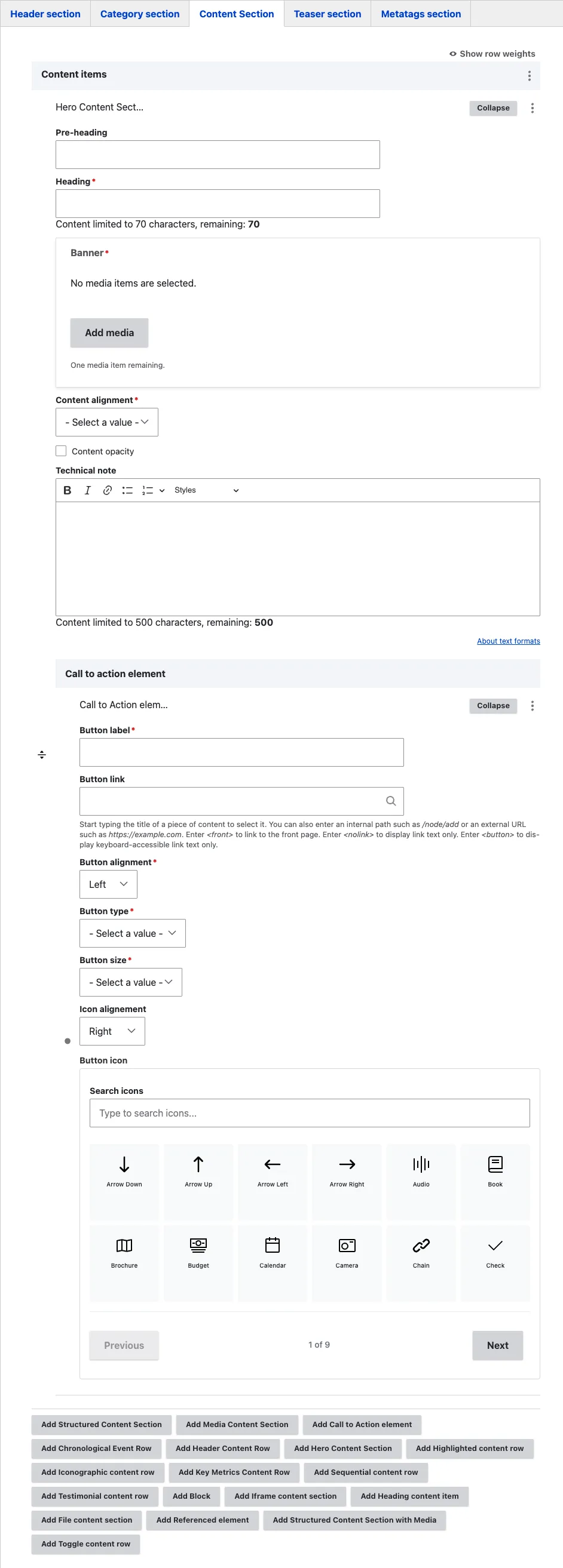
A sub-form opens with seven fields.
3. Fill the headings
- Pre-heading (optional) — a small kicker line above the main heading. Use it for a short context label such as “Mission spotlight”, “Programme update”, or a section number. Keep it to three or four words.
- Heading (required) — the section heading laid over the banner. Renders at section level (not as the page H1). Keep it short and decisive — long headings wrap onto multiple lines and lose visual impact.
4. Pick the Banner
- Banner (required) — opens the media library filtered to the Image bundle. Pick a high-resolution image (1920×1080 minimum, 16:9 ratio works best). The heading sits over it, so prefer visually rich images that do not already contain text or a competing subject in the area where the heading will appear.
5. Set alignment and opacity
- Content alignment (required) — choose Left, Right, or Center. Controls where the heading, technical note, and CTA sit horizontally inside the hero. Pick the side that does not collide with the banner’s focal point: if the banner image has a subject on the right, align content Left so they do not overlap.
- Content opacity (optional) — tick to apply a dark overlay over the banner. Use it whenever the banner is light or busy and the white text becomes hard to read. Untick it when the banner is already dark.
6. Fill the Technical note (optional)
- Technical note (optional) — a short rich-text paragraph shown below the heading, over the banner. Use it to add one sentence of context the heading alone does not carry. Keep it brief — anything longer becomes hard to read on top of an image. For full body content, add a separate Structured content section below the Hero.
7. Add a Call to action (optional)
- Call to action element (optional) — click Add Call to action element to attach a single button to the Hero. Fill the standard CTA fields (label, link, type, size, icon — see Call to action).
The Hero accepts one Call to action. If you need two buttons, place a separate block with a CTA pair underneath the Hero instead.
8. Save
Click Save on the page-editing form. The Hero appears in the body where you positioned it.
Field explanations
| Field | What editors should enter or select |
|---|---|
| Pre-heading | An optional short context label above the main heading, such as “Mission spotlight”. |
| Heading | The required visitor-facing section heading. It is not the page H1. |
| Banner | A high-resolution image that works behind overlaid text. A 1920 × 1080-pixel image in a 16:9 ratio works best. |
| Content alignment | Places the heading and supporting content on the left, right, or centre of the image. |
| Content opacity | Adds a dark overlay when the image is too light or busy for white text. |
| Technical note | One short public-facing paragraph shown below the heading. |
| Call to action element | One optional button. See Call to action. |
Difference between Hero content section and Header content row
| Hero content section | Header content row | |
|---|---|---|
| Purpose | An in-body visual section | The page banner at the very top |
| Where you add it | Content Section tab → Content items | Header section tab → Content header field |
| Heading level | Section heading | Page H1 |
| Position | Anywhere in the body | Only at the top of the page |
| Pre-heading field | Yes | No |
| Visual width | Contained (margins on the sides) | Edge-to-edge full-width |
If in doubt, ask “is this the first thing visitors see when they arrive on the page?” → use Header content row. “Is this a section inside the page?” → use Hero content section.
Common mistakes
- Using a Hero where a Header content row belongs. If the visual is meant to be the page’s opening banner, it belongs in the Content header field as a Header content row, not in Content items as a Hero.
- Heading too long. Long headings wrap awkwardly over the image. Cut to the essentials.
- Banner with competing visual elements behind the heading. If the image already has text or a subject on the side where you have aligned the content, the heading becomes hard to read. Pick a cleaner image, change the alignment, or tick Content opacity.
- Skipping Content opacity on a light banner. White text on a light banner is invisible. When in doubt, tick Content opacity.
- Multiple calls to action. The Hero only takes one button. Adding more options dilutes the focus.
- Two Heroes back-to-back. Heroes are visually expensive. One per page is usually enough; two in a row compete with each other.
Tips
- The Pre-heading is the right place for a short category label. Avoid creating a separate heading block above the Hero for that purpose — it doubles up the visual hierarchy.
- For a long page with several major sections, one Hero halfway down can re-anchor the visitor’s attention. Use it as a deliberate visual reset, not as decoration.
- Pair the Hero with a contrasting Structured content section directly below it. The Hero introduces the chapter; the text section delivers the substance.
Example
This example uses a Hero content section to introduce a prominent topic within the page body.