Referenced element
version 0.1 Read time 2m 26
Purpose
A Referenced Element displays cards for one or more existing published pages inside another page. Use it to surface related Resources, News articles, Events, Funding opportunities, Use Cases, Image of the Day entries, or Structured Templates without copying their content.
Each card uses the teaser style of the selected page’s content type. You can select several pages in one Referenced Element, and they appear as a row of cards.
When to use
Use it for a small, curated set of related pages whose cards should stay synchronised with the original content. Use a Listing Page or Block listing when visitors need an automatically generated or filterable collection rather than a manually selected set.
Steps
1. Make sure the pages exist
The autocomplete only finds pages that have already been saved. A page can be selected while it is still a Draft, but public visitors cannot open its card until it is published.
2. Add the content block
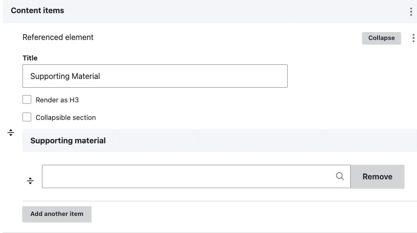
In Content items, click Add Referenced element.
A sub-form opens with four fields:
- Title (optional) — section title above the row of cards (“Related resources”, “More from this mission”). Renders as H2 by default.
- Render as H3 (optional) — tick when nested under another heading.
- Supporting material — type the title of the page you want to display and select it from the matching suggestions. Select Add another item to include another page.
- Collapse (optional) — enable this to make the section collapsible, so visitors must click to expand it. Useful for long or secondary content you want to keep tidy without cluttering the page.
3. Add more references
Use Add another item in the Supporting material field to select several pages. Their cards appear in the order in which you add them.
4. Save
Click Save on the page-editing form.
Field explanations
| Field | What editors should enter or select |
|---|---|
| Title | An optional heading above the cards, such as “Related resources”. |
| Render as H3 | Select when the card row belongs under an existing H2. |
| Supporting material | One or more existing pages selected by title. Cards follow the order in which the pages are added. |
| Collapse | Hides the cards until a visitor expands the section. Use for secondary supporting material. |
What can be referenced
The autocomplete is restricted to seven content types:
- News
- Event
- Image of the day
- Resource
- Funding opportunity
- Structured template
- Use cases
Listing Pages are not selectable. By design, they are excluded from referenced-content fields and from the internal site search.
Common mistakes
- Selecting an unpublished page. Public visitors cannot open its card. Publish the selected page before publishing the page that references it.
- Mixing content types. Cards have different shapes per type. A row that mixes a News card + an Image-of-the-day card + a Resource card looks visually inconsistent. Group references by type using one Referenced element per type, with a Heading content item above each.
- Adding too many cards. If you need more than six items of the same type, create or use a Listing Page instead.
Tips
- You cannot customise a card from the Referenced Element. To change it, edit the selected page’s teaser title, text, or image.
- Use
Collapsewhen the references are supporting / supplementary material the visitor may want to skip. Leave it unticked when the references are the main point of the section. - Three to four references is the visual sweet spot. Above six the cards become small and the row wraps awkwardly.
Example
For a page about a Copernicus mission, add a Referenced Element titled Related resources and select three published Resource pages. Each card will use the selected Resource’s teaser title, summary, and image and will update when that source page is updated.