Visual design and interface
version 0.1 | Read time 3m 34s
The portal applies its visual design automatically. Editors choose appropriate images, icons, headings, and available layout options; they do not need to format individual pages with custom colours, fonts, spacing, or code.
The interface is built from five main visual elements:
- colour;
- typography;
- imagery;
- iconography; and
- layout and spacing.
Colour
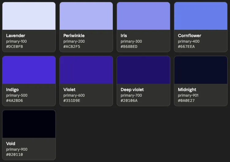
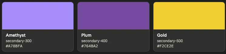
The site uses a defined colour palette to keep pages consistent and accessible. Editors cannot add custom colours to individual content blocks.
Primary colours
Secondary colours
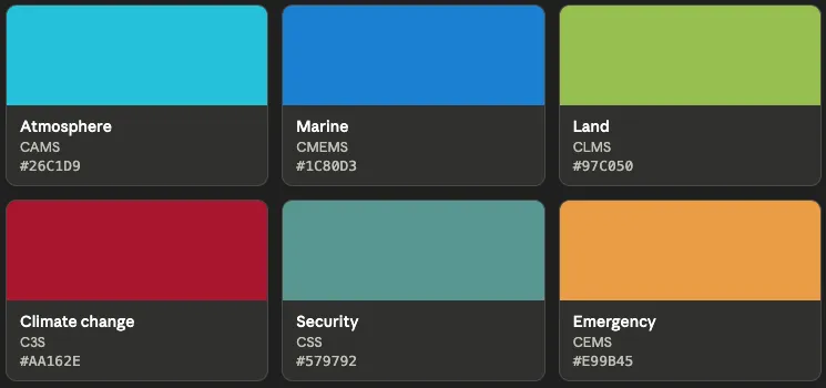
Copernicus service colours
Each Copernicus service has its own accent colour. The site applies the appropriate accent to service landing pages, banners, and menus; editors do not select it manually.
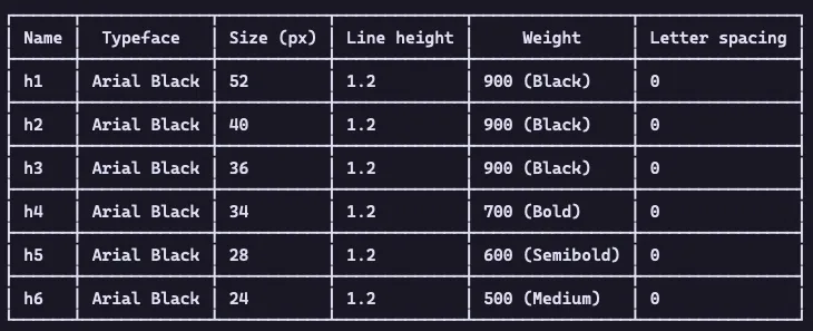
Typography and headings
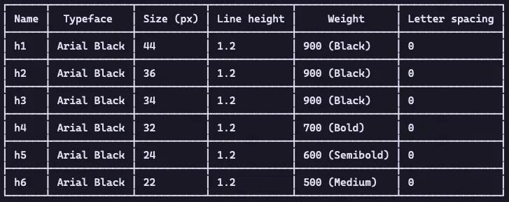
The site applies its fonts, text sizes, and spacing automatically. Editors should use headings to organise the meaning of a page, not to change the appearance of text.
- Use Heading 2 (H2) for the main sections below the page title.
- Use Heading 3 (H3) for subsections within an H2 section.
- Do not choose a heading level because it looks larger or smaller.
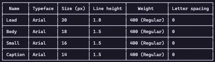
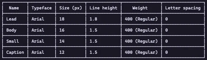
The design adjusts typography for desktop and mobile screens.
Heading desktop
Heading mobile
Body desktop
Body mobile
Imagery
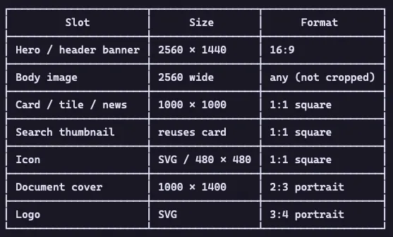
Choose images that support the page’s subject and remain clear at different screen sizes. Suitable subjects include Earth-observation imagery, technical diagrams, programme partners, events, and people using space-based services.
For each image:
- use a high-resolution file; hero banners should be at least 1920 × 1080 pixels with a 16:9 aspect ratio;
- add a meaningful alternative-text description when the image conveys information;
- record the source or attribution in the image’s Caption field; and
- confirm that the image has been cleared for reuse, particularly when it comes from a third party.
Animated GIFs are shown without image resizing so that their animation is preserved. A dedicated media-library guide is being prepared.
Iconography
The method used to select an icon depends on the content block and field:
- ECL icon picker — used by the Button icon field in a Call to Action block. Search or browse the widget, then select an icon. Do not upload an image into this field.
- Icon media item — used by the Icon field in Iconographic Content Rows, Sequential items, and Key Metric items. Select an existing icon from the media library or upload a supported SVG, PNG, GIF, JPG, JPEG, or WebP file. An uploaded icon can be reused in other content blocks.
The content block determines the displayed icon size. Editors do not set the size manually.
Do not paste raw SVG code into a rich-text field. If the required icon is not available in the ECL icon picker or the media library, upload it as a new Icon media item.
Layout and background
The options available to editors depend on the selected content block.
- On supported blocks, Layout/background colour changes the section background. Default uses white and Grey uses light grey. This setting does not change the position or width of the content.
- On a Structured Content Section with Media, the selected Variant controls the position of the media. Some variants can display media across the full width of the screen.
- On a Structured Template page, the selected Page type category can determine whether sections extend across the full screen.
Other widths, columns, alignment, and spacing are applied automatically by the site theme.
Editor checklist
Before publishing, check that:
- the page uses headings in a logical order;
- images are clear, credited, and cleared for reuse;
- informative images have suitable alternative text;
- icons were selected through the correct field; and
- the available background and layout options are used consistently.
How the site applies its design
The following implementation details explain why some visual settings are automatic or unavailable in the editing form:
- The portal follows Europa web standards. A set of reusable design values, called design tokens, gives the portal its EU Space Programme identity while keeping colours and components consistent.
- The colour palette is designed to meet WCAG 2.1 AA contrast requirements for important interface elements. Editors should therefore use the supplied colour options instead of trying to introduce a custom colour.
- In the site code, colour tokens are defined in
lib/themes/defis_space_program/sass/tokens/_colors.scssand made available as CSS variables beginning with--ecl-color-or--eusp-color-. These are internal theme values, not text that editors need to enter in a field. - Typography uses Arial, with Arial Black for headings and titles. The theme, rather than the editor, applies the correct font and size.
- Page layouts use the ECL 12-column grid. The selected content block and its variant determine how those columns are used.
- Full-width rendering is controlled by the theme, component variant, and page type; it is not a separate editor setting.
- The site’s Content Security Policy prevents inline styles, scripts, HTML attributes, and raw SVG code in rich-text fields. For editors, this means that visual changes must use the available fields and component options. If an option is missing, request an approved theme or stylesheet change instead of pasting code into the page.