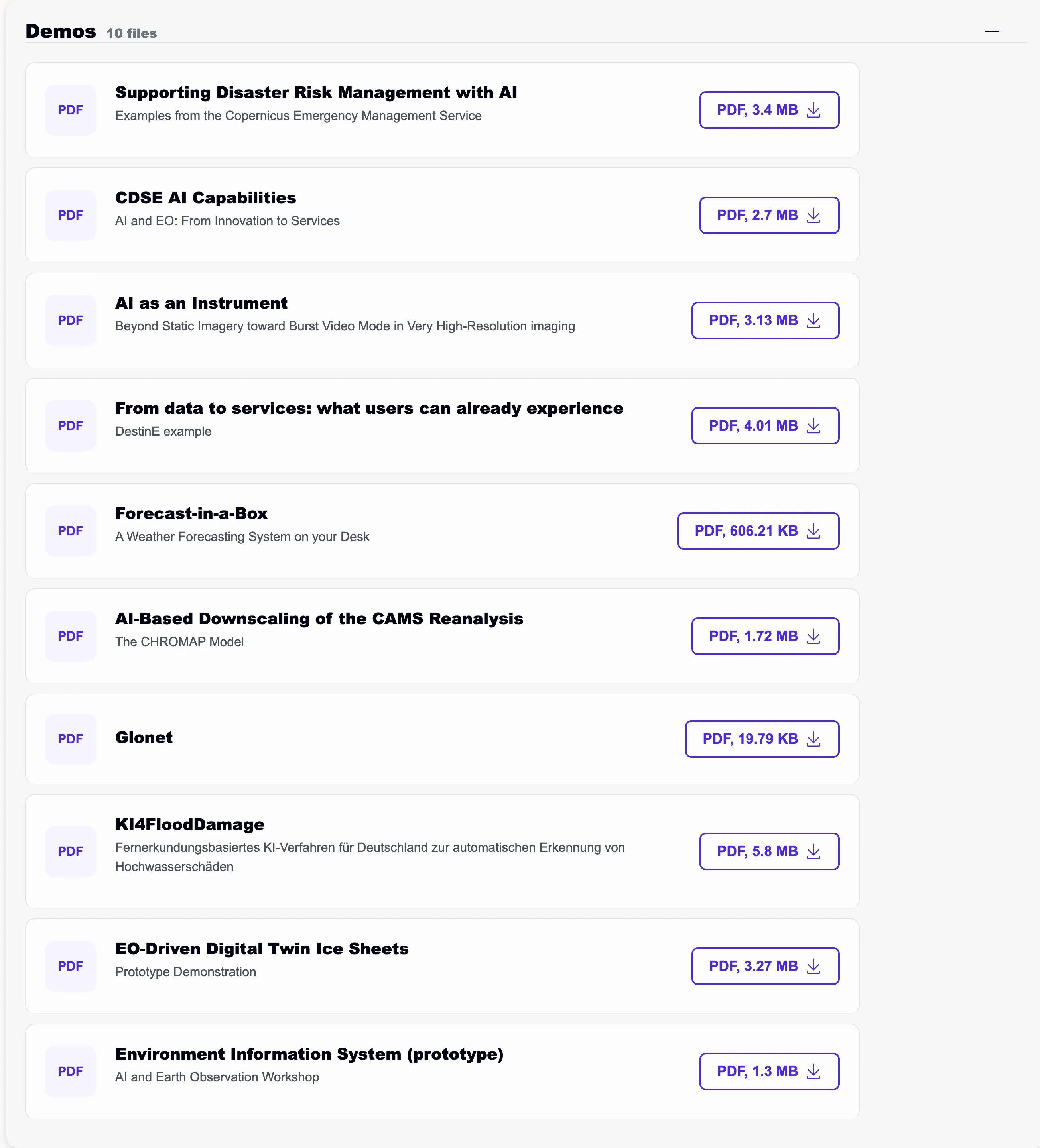
File content section
version 0.1 Read time 3m 28s
Purpose
A File Content Section lists downloadable files, such as PDFs, factsheets, and presentations. Each File Content Item within the section contains one file. The list can remain open or be made collapsible so that visitors expand it when needed.
When to use
Use this content block when a page contains two or more downloadable files that will not be reused elsewhere. If a file should be reusable or discoverable through search, create a Resource page and add it through a Referenced element.
Steps
1. Add the section
In Content items, click Add File content section.
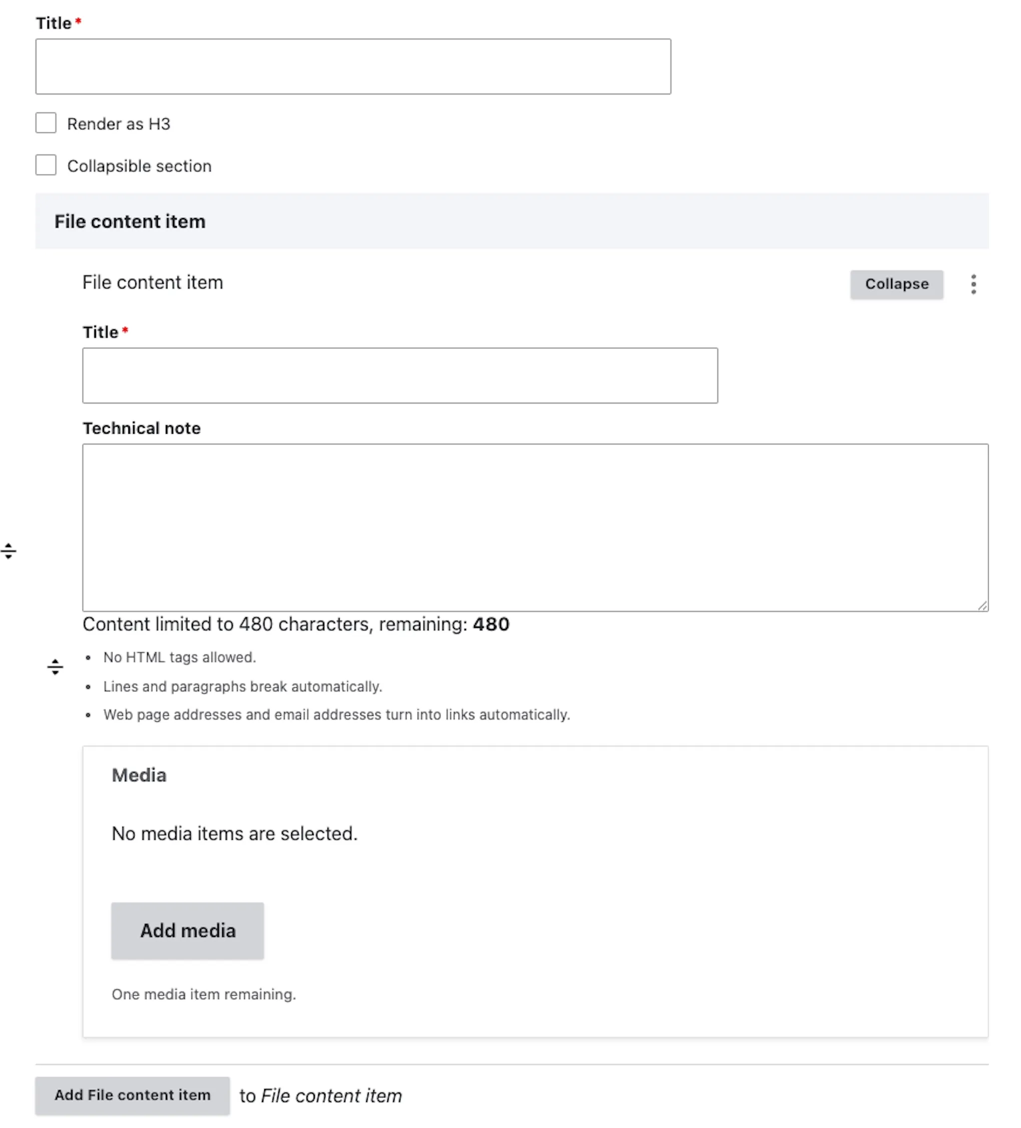
A section block appears with:
Section-level fields (top)
- Title — a title for the file section. Required if the section is to be collapsed by default.
- Render as H3 — a checkbox to output the title as an H3 heading. If not selected, the title renders as an H2.
- Collapsible section — a checkbox to make the whole section collapsible. This uses the same collapse pattern as Toggle content row.
File content item (nested block)
- Title — the name of the file; a required field. Use a descriptive label (e.g. “2024 Annual Report (PDF)”, not
report.pdf). - Technical note — a multi-line text area limited to 480 characters (a live counter shows “remaining: 480”). An internal note for editors, not shown to public visitors — use it to record review dates, expiry, or version history.
- Media — selects or uploads one item from the media library. This field accepts the File media type only; images and videos are not available.
2. Fill the section header
- Title — the H2 / H3 above the list (“Reports”, “Mission briefings”). Leave empty if the surrounding context already labels the list.
- Render as H3 — tick when nested under another heading.
- Collapsible section — tick to render the section as an accordion the visitor must click to expand. Leave unticked for a list that is open by default. The collapse pattern is the same one used by Toggle content row.
3. Add the first file
- Title — the visible row label / download label. Use a descriptive name (e.g. “2024 Annual Report (PDF)”, not
report.pdf). - Media — opens the media library and accepts files only. Select an existing file or upload it from the library if it is not already available.
- Technical note — an internal note for editors. Not shown to public visitors. Use it to record review dates, expiry, or version history.
4. Add more files
Click Add File content item for each additional file. Drag the row handles to reorder. The order in the back-office is the order visitors see.
5. Save
Click Save on the page-editing form. The section and all its file items are saved together as part of the page.
Field explanations
| Field | What editors should enter or select |
|---|---|
| Section Title | An optional heading above the list. It is required when the section is collapsible. |
| Render as H3 | Select when the file section belongs under an existing H2. |
| Collapsible section | Hides the list until a visitor expands it. Use for a long or secondary list. |
| File item Title | The public download label, such as “2024 Annual Report (PDF)”. |
| Technical note | An internal editor-only note of up to 480 characters for review dates, expiry information, or version history. |
| Media | One file selected from or uploaded to the media library. Images and videos are not accepted in this field. |
Removing or replacing a file
- Replace the file — open the item, click Remove on the media widget, then upload / pick the new file.
- Remove the row entirely — click Remove on the item row, then Confirm removal.
- Replace the library file while keeping its URL — open the existing file item from the Media dashboard at
/admin/content/mediaand upload the replacement into the same item. Pages using that media-library item retain the same visitor-facing URL.
Common mistakes
- Trying to attach an image or video. The media widget accepts files only. Images and videos belong in a Media content section.
- Using vague titles. “Document 1”, “Annex” — assistive technology reads these aloud, and they tell screen-reader users nothing. Spell out what the file is.
- Leaving the Title empty. Without a Title the download button shows just the file name (often
final_v3_REVIEWED.pdf). Always set a Title.
Tips
- Group files by theme using multiple File Content Sections separated by Heading content items (“Annual reports”, “Mission briefings”, “Datasets”) rather than one giant list.
- Use Collapsible section when the list is long (more than six entries) — it keeps the page scannable. Leave it unticked for a small list the visitor needs to see at a glance.
- For visual downloads such as factsheets, infographics, or posters, create a Resource page and add it through a Referenced Element. Resource cards can show a thumbnail; File Content Items cannot.
Example
This example shows a visitor-facing list of clearly labelled downloads.