Header content row
version 0.1 Read time 3m 45s
Purpose
The Header content row is the banner that sits at the very top of a page — a full-width image with a heading laid over it, an optional short paragraph below the heading, and an optional Call to action button. It is what visitors see first when they land on a Use case or a Structured template page.
It is available only on Structured Template and Use Cases pages, and only in the dedicated Content header field at the top of the editing form. It is not added to the main Content items body stack.
When to use
Use it whenever a page genuinely deserves a strong visual opening: a service landing page, a programme overview, a featured Use case. Pages that are mostly text-and-list content do not need a Header content row — leave the field empty and the page renders without a banner.
Steps
1. Open the Header section tab
On a Structured Template or Use Cases editing form, select the Header section tab. You will see the Content header field.
2. Add a Header content row
Click Add Header Content Row. A sub-form opens with six fields.
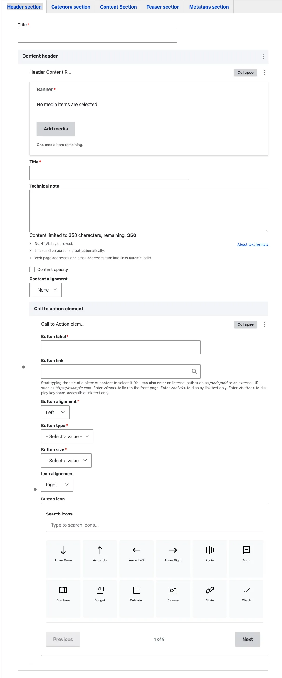
3. Fill the Title
- Title (required) — the heading displayed over the banner. When the Header Content Row is present, this title becomes the visible page H1. Keep it short because long headings wrap over the image and lose visual impact.
How this relates to the page Title field: Drupal continues to use the page’s main Title field as its internal name and as the basis for the URL. If the Header Content Row is removed, that main Title becomes the visible H1. The two titles may differ, but they should describe the same page. Keep them identical unless the banner needs a shorter visitor-facing heading.
4. Pick the Banner
- Banner (required) — opens the media library filtered to the Image bundle. Pick a high-resolution image (1920×1080 minimum, 16:9 ratio works best). The title sits over it, so prefer visually rich images that do not already contain text or a competing subject in the area where the title will appear.
5. Set alignment and opacity
- Content alignment (optional) — choose Left, Right, or Center. Controls where the title, technical note, and CTA sit over the banner. Pick the side that does not collide with the banner’s focal point: if the banner image has a subject on the right, align content Left so they do not overlap.
- Content opacity (optional) — tick to apply a dark overlay over the banner. Use it whenever the banner is light or busy and the white title text is hard to read. Untick it when the banner is already dark.
6. Fill the Technical note (optional)
- Technical note (optional) — a rich-text paragraph shown below the title, over the banner. Use it to add one short sentence of context the title alone does not carry. Keep it brief. Anything more than one or two sentences becomes hard to read on top of an image — put longer text in a body section below the banner.
7. Add a Call to action (optional)
- Call to action element (optional) — click Add Call to action element to attach a single button to the banner. Fill the standard CTA fields (label, link, type, size, and icon — see Call to action). If the button is no longer required, open its three-dot actions menu and select Remove.
The Header content row accepts one Call to action. If you need a primary/secondary button pair, place it in a body section below the banner, not in the header.
8. Save
Click Save on the page-editing form. The banner appears at the top of the page.
Field explanations
| Field | What editors should enter or select |
|---|---|
| Title | The visitor-facing page heading shown over the banner. It becomes the page H1 while this block is present. |
| Banner | A high-resolution image that remains readable behind overlaid text. A 1920 × 1080-pixel image in a 16:9 ratio works best. |
| Content alignment | Places the title and supporting content on the left, right, or centre of the banner. |
| Content opacity | Adds a dark overlay when the image is too light or busy for white text. |
| Technical note | One or two short sentences shown below the title. Despite the field name, this is public visitor-facing text. |
| Call to action element | One optional button. See Call to action for its fields. |
Common mistakes
- Banner with competing visual elements behind the title. If the image already has text or a strong subject on the side where you have aligned the content, the title becomes hard to read. Either pick a cleaner image, change the alignment, or tick Content opacity.
- Skipping Content opacity on a light banner. White title text on a light banner is invisible. When in doubt, tick Content opacity.
- Multiple calls to action. The Header content row only takes one. Adding more options here dilutes the focus.
- Treating it as a normal body section. The Header Content Row is the page’s opening banner. Do not try to place body blocks above it, and keep the Technical note brief.
Tips
- On Use case pages, the Header content row is typically the only visual element at the top. Choose a banner that represents the use case visually — a satellite image of the affected area, a photo of the operating team, an emblematic field.
- On Structured template service home pages, the Header content row sets the tone for the whole service. Reuse the same visual treatment across all home pages of the same service so visitors recognise the family.
- If you leave the Content header field empty, the page renders without a banner — perfectly valid for inner pages that do not need a visual statement.
Example
The following example shows a Header content row used as the opening banner of a page.