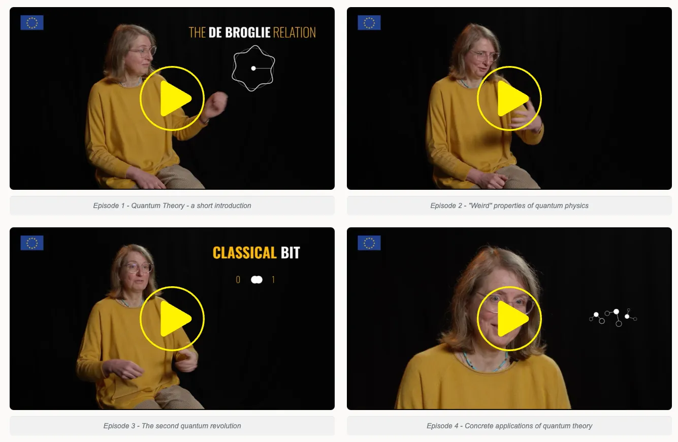
Media content section
version 0.1 Read time 3m 52s
Purpose
The Media content section places one or more media items (image, video, podcast) inside a page. With two items added inside the same section, they render side by side as a 2-column asset — the main use case for this block.
You do not add a Media content item directly into the page body. Media content items are children of a Media content section, added through the section’s Add Media Content Item button. The section wraps them, applies the side-by-side layout when there is more than one, and carries the section heading and background colour.
When to use
| Number of items in the section | What renders | Use it for |
|---|---|---|
| 1 item | A single full-width media | A standalone image, video, or podcast that does not need a richer composition (use Structured content with media if you want text alongside it). |
| 2 items | A side-by-side 2-column asset | The most common use case — comparing two visuals, pairing a video with an image, showing “before / after”, or any two-up layout. |
| 3+ items | A grid that wraps onto multiple rows | Less common; consider whether each item really needs to sit at the same visual weight, or whether a different block fits better. |
Steps
1. Add a Media content section
On the page-editing form, open Content items and select Add Media Content Section.
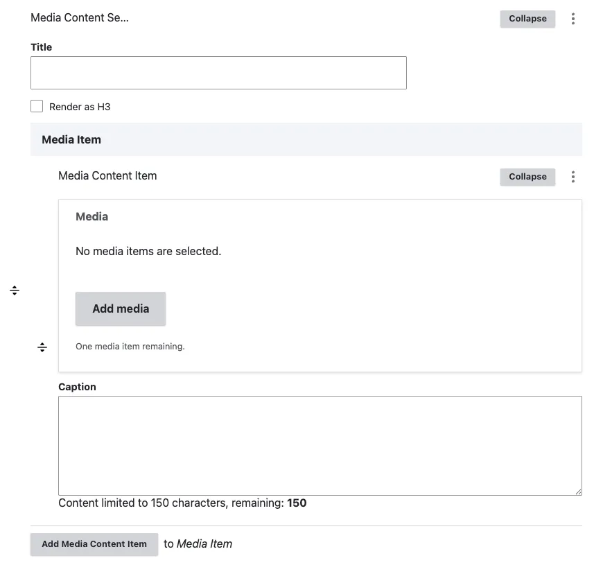
The section opens with three section-level fields plus an empty Media items panel.
2. Fill the section header (optional)
- Title (optional) — a heading that appears above the media row. Leave empty for an untitled row.
- Render as H3 (optional) — tick when this section sits under another heading and should not start a new H2. Leave unticked for a top-level H2.
- Layout / background colour (optional) — choose Default (white) or Grey to give the section a soft grey background. Useful when you want the row to visually separate from the surrounding text.
3. Add the first media item
In the Media items panel, click Add Media Content Item. A sub-form opens with two fields:
- Media — opens the media library widget. Pick an existing media or upload a new one. Accepted media types: Image, AV portal video, Remote video, Podcast. File is not available here — for downloadable documents use a File content section.
- Caption (optional) — short text rendered with the media. Keep it to one short line — captions are not body copy.
4. Add the second media item for the 2-column layout
Click Add Media Content Item a second time. A second sub-form opens. Fill it the same way.
As soon as the section has two items, the front-end renders them as a side-by-side 2-column row (on tablets and desktops; they stack vertically on phones). This is the layout most editors will want.
5. Reorder or remove items
- Reorder — drag the row handle on the left of each item. The order in the form is the order on the page.
- Remove — click the row’s collapse handle, then Remove, then Confirm removal. The item is deleted on save.
6. Save
Click Save on the page-editing form. The section and all its media items are saved together as part of the page.
Field explanations
| Field | What editors should enter or select |
|---|---|
| Title | An optional heading above the media row. |
| Render as H3 | Select when the section belongs under an existing H2. |
| Layout / background colour | Default uses white; Grey adds a light-grey section background. |
| Media | One image, AV portal video, remote video, or podcast for each nested Media Content Item. Files are not accepted. |
| Caption | Optional short visitor-facing text displayed with the media item. |
Common mistakes
- Adding a Media content item somewhere other than inside a Media content section. Media content items only exist as children of the section. You will not find an “Add Media Content Item” option in the main Content items list — only inside a section.
- Adding one item and expecting a 2-column layout. Two columns appear only when there are at least two items inside the same section. One item renders full-width.
- Mixing portrait and landscape items in the 2-column layout. The two columns share a row; portrait + landscape together produces uneven heights. Use media items with similar proportions for the cleanest result.
- Trying to attach a file (PDF, .docx, etc.). The media library filters out the File bundle inside Media items. Use File content section for downloadable documents.
- Long captions. Keep captions to one short line. Put longer explanations in a separate text content block above or below the media section.
Tips
- For a “before / after” or comparison effect, pair the two media items with paired captions (“Before satellite intervention” / “After satellite intervention”).
- When pairing a video with a still image, put the video on the left if it is the primary content — readers’ eyes go left-first.
- If your row genuinely needs three or more items, consider splitting them into two Media content sections separated by a short heading. Three-up grids work technically but read as denser than a 2-column pair.
- The Grey layout option is useful when the 2-column row sits between two long text sections — the colour change signals a visual break.
Example
This example shows media items presented together within one section.