Working with content blocks
version 0.1 | Read time 6m
EU Space pages are assembled from reusable content blocks, called paragraphs in Drupal. Each block provides a particular type of content or layout, such as text, media, a banner, a timeline, or an accordion. Add the blocks in the order visitors should encounter them.
This guide explains how to add and manage content blocks and provides the complete catalogue of available block types.
Where content blocks are added
The editing form can provide two block fields:
- Content header — appears in the Header section on Structured Template and Use Cases pages. It accepts a Header Content Row or another supported opening block and displays it at the top of the page.
- Content items — appears in the Content Section and contains the ordered blocks that form the page body. The Hero Content Section belongs here, not in the Content header.
Add a content block
- Open the Header section or Content Section, depending on where the block belongs.
- Find the relevant block field.
- Select the appropriate Add… button. Less frequently used blocks are available under List additional actions.
- Complete the fields that open in the form. See the component catalogue below for instructions for each block.
- Save the complete page.
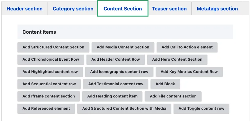
Reorder, remove, or collapse a block
- Reorder — drag the handle on the left of a block. The order in the editing form is the order displayed on the page. The same method applies to repeating items inside a container block. Items are not sorted automatically, including dates in a Chronological Event Row.
- Remove — select Remove, followed by Confirm removal. Save the page to complete the removal. Removing a container also removes its nested items from that page.
- Collapse in the editing form — select the row’s Collapse action to hide its fields while editing a long page. This does not change the published page. Do not confuse it with a component’s Collapsible section or Collapse field, which does change what visitors see.
Variants and conditional fields
Some selections determine which fields are displayed:
- Structured Content with Media — Variant controls the position of the text, whether the block uses media or an iframe, and whether it includes a CTA.
- Render as H3 changes a component title from H2 to H3 when the component belongs under an existing H2.
- File Content Section — Collapsible section changes an open download list into a click-to-expand section.
Choose a variant before completing the other fields. If a variant is changed later, previously entered information may be hidden. Drupal retains the information, but it is not displayed unless the corresponding variant is selected again.
Common fields
| Field | What editors should enter or select |
|---|---|
| Title, Heading, or Section title | The visitor-facing heading above the block. It is normally displayed as H2. |
| Render as H3 | Select when the block belongs beneath an existing H2. |
| Detailed Note, Technical note, or body field | The block’s rich-text content. Check the individual component guide because some Technical note fields are public while others are editor-only. |
| Layout / background colour | Selects the standard white or light-grey background where supported. It does not change the block’s position or width. |
| Call to action element | Adds one optional button to a component that supports a CTA. |
Save content blocks
The CMS saves the page, its content blocks, nested items, and CTA buttons together as one revision. An individual block cannot be saved separately.
If a required field is empty, the page is not saved. The form moves to the first field that needs attention. Complete the field and save the page again.
Choose a content block
Most body blocks can be combined freely. Choose the block that matches the content’s purpose rather than selecting one only for its appearance.
Page header block
Used only in the dedicated Content header field at the top of the page.
| Block | What it does |
|---|---|
| Header Content Row | The standard page header. It combines a title, banner image, optional short text, and one optional call-to-action button. |
In-body visual block
Used in Content items, not in the page header.
| Block | What it does |
|---|---|
| Hero Content Section | A prominent in-body section with a pre-heading, heading, banner image, short text, and optional CTA. |
Text sections
| Block | What it does |
|---|---|
| Structured Content Section | A titled rich-text section with a white or grey background. |
| Structured Content with Media | Text beside an image, video, podcast, or iframe. Eight variants control the layout and optional CTA. |
| Heading content item | A stand-alone heading used to introduce a group of content blocks. |
Media blocks
| Block | What it does |
|---|---|
| Media Content Section | Displays one or more images, videos, or podcasts. Two items create a side-by-side layout. |
| Iframe content section | Embeds an approved third-party tool, viewer, or external page through a structured form. |
Specialist viewer blocks
| Block | What it does |
|---|---|
| CAMS viewer | Adds an approved CAMS visualisation through its dedicated component. |
| AeroVal viewer | Adds an approved AeroVal visualisation through its dedicated component. |
Repeating blocks
| Block | What it does |
|---|---|
| File content section | Displays a list of downloadable files, optionally in a collapsible section. |
| Toggle content row | Creates an accordion of expandable questions or topics. |
| Key Metrics Row | Displays a strip of headline figures or icons with short labels. |
| Iconographic content row | Creates one icon-and-text tile. Add separate rows to build a consistent vertical list. |
| Sequential content row | Presents an ordered process through a series of tabs and content panels. |
| Chronological content row | Presents manually ordered, dated milestones in a timeline. |
Highlight blocks
| Block | What it does |
|---|---|
| Highlighted content | Emphasises one important message, result, or announcement. |
| Testimonial content | Displays a short quotation with its author. |
Action and reference blocks
| Block | What it does |
|---|---|
| Call to action | Adds a configurable button inside a component that supports a CTA field. |
| Referenced element | Displays cards for a small, editor-selected set of existing pages. |
| Block listing | Inserts an approved, automatically populated listing inside the page body. |
| Menu | Inserts an approved menu, such as local sub-navigation, inside the page body. |