Iconographic content row
version 0.1 Read time 2m 07s
Purpose
An Iconographic content row is a single tile with an icon on the left and short text on the right. Unlike other row components, it does not contain nested items: each row creates one tile.
When to use
Use one tile for a short supporting point that benefits from an icon, or add two to four separate rows to create a consistent vertical list. Use a Key Metrics row for prominent numbers, a Media content section for photographs, or a Sequential content row when each point needs a longer explanation.
Steps
1. Add the first tile
In Content items, click Add Iconographic content row.
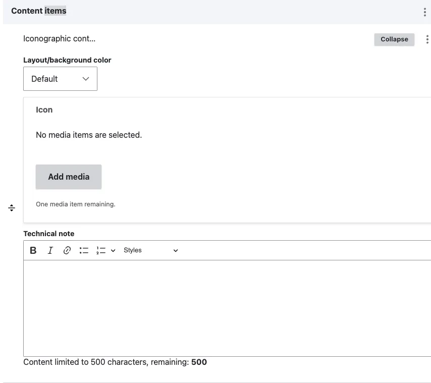
A sub-form opens with the following fields:
- Layout/background color (optional) — adds either the Default page background or a light-grey band behind the tile.
- Icon (optional) — opens the media library for icons. Select an existing icon or upload a new one.
- Technical note (recommended) — the public-facing rich text shown next to the icon. Basic text formatting and links are available.
2. Add more tiles
To create a list of tiles, select Add Iconographic content row again for each additional tile. The published page stacks the tiles vertically at the full width of the text column; they do not appear side by side.
For consistency, give every tile in the same list:
- icons in the same visual style;
- a roughly equal length of body text; and
- the same background color, because mixing Default and Grey bands in one list looks inconsistent.
3. Save
Click Save on the page-editing form.
Field explanations
| Field | What editors should enter or select |
|---|---|
| Layout/background color | Default uses the page background; Grey adds a light-grey band behind the tile. Use the same setting for adjacent tiles. |
| Icon | One reusable icon selected from or uploaded through the media library. |
| Technical note | The public-facing text displayed beside the icon. Keep it to one or two sentences. |
Common mistakes
- Mixing icon styles. Outline and filled icons in the same list look inconsistent. Pick one style and use it throughout.
- Mixing background colors within one list. Alternating Default and Grey tiles produces an unintended striped effect. Set the same value on every tile in the list.
- Body text too long. The tile is small — keep the Technical note to one or two sentences. If you have more to say, use Sequential content row instead.
Tips
- A single tile works as a self-contained full-width band. Lists of two to four tiles are the most common pattern.
- On narrow screens, the icon appears above the text. Preview on mobile when the text is longer than one sentence.
- If a tile needs a number, photo, or longer description, choose a different content block: Key Metrics Row for numbers, Media Content Section for photos, or Sequential content row for longer explanations.
Example
The following example shows one icon-and-text tile. Additional tiles would be added as separate Iconographic content rows.