Call to action
version 0.1 Read time 2m 53s
Purpose
A Call to Action element is a configurable button. It is normally added inside another content block, such as a Header Content Row, Hero Content Section, Structured Content with Media block, Highlighted Content Row, or Sequential item.
The process is the same wherever the button appears. Open the parent content block and find the Call to action element panel. If its fields are not already open, select Add Call to Action element.
When to use
Use a CTA when the surrounding content leads to one clear next action, such as registering, downloading, reading more, or exploring a dataset. Do not add a button when a normal text link is sufficient or when the destination is unrelated to the section.
Each parent content block accepts one CTA. Header and Hero blocks should have one focused action; Sequential items may each have their own relevant action.
Steps
This walkthrough uses the Header Content Row as the host — the workflow is identical inside Hero, Highlighted content and Sequential items.
1. Open the parent content block
Open the content block that should contain the button, such as a Header Content Row you have already added.
2. Open the CTA sub-form
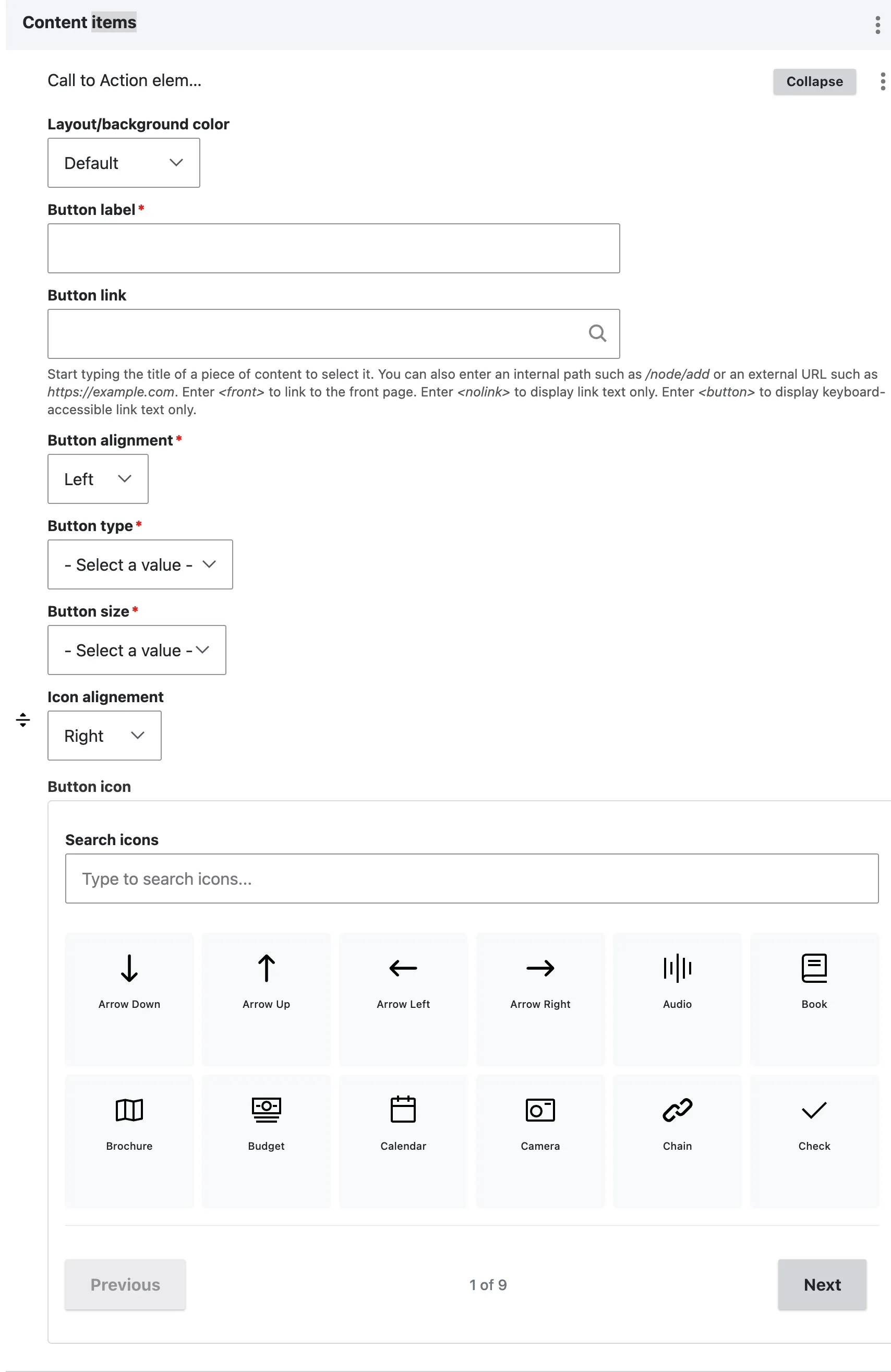
Inside the host, find the Call to action element panel and select Add Call to action element. A sub-form opens with eight fields. If the button is no longer required, open the three-dot actions menu and select Remove.
3. Fill the essentials
- Button label (required) — the visible text. Use an action verb: “Register”, “Download”, “Read more”, “Explore the data”. Avoid “Click here” — assistive technology reads the label out of context.
- Button link (optional but expected) — for another EU Space page, start typing its title and select it from the suggestions. This keeps the link working if the page URL changes. For another website, paste the full external URL.
4. Pick the visual
- Button type (required) — five options:
| Variant | Use when |
|---|---|
| Primary | The single most important action on the page. One per section. |
| Secondary | A complementary action alongside a primary. |
| Tertiary | A lower-priority action. |
| Ghost | Transparent button outlined in primary colour. Use on busy / coloured backgrounds. |
| Link | Inline-link style. Low-emphasis navigation. |
- Button size (required) — Small / Default / Large.
- Button alignment (required) — Left / Right / Center. Where the button sits inside its container.
5. Add an icon (optional)
- Button icon — use the icon-picker widget to search or browse the available ECL icons, then select the icon you want. This field does not use the media library.
- Icon alignment — Left or Right (whether the icon appears before or after the label).
Leave both empty for a label-only button.
6. Layout
- Layout / background colour — leave at Default unless you specifically need a Grey-tinted button frame.
7. Save the parent
The CTA is saved as part of its parent content block when you save the page.
Field explanations
| Field | What editors should enter or select |
|---|---|
| Button label | A short action phrase, ideally three or four words, such as “Register for the event”. |
| Button link | An internal page selected by title or a complete external URL. |
| Button type | The visual priority: Primary, Secondary, Tertiary, Ghost, or Link. |
| Button size | Small, Default, or Large. Use the established size of surrounding buttons. |
| Button alignment | Places the button on the left, right, or centre of its parent component. |
| Button icon | An optional icon selected through the icon-picker widget, not the media library. |
| Icon alignment | Places the icon before or after the button label. |
| Layout / background colour | Applies the available standard or grey background treatment. |
CTA use within parent components
- Header Content Row / Hero — one CTA. The hero’s visual budget already commits the visitor; competing buttons dilute it.
- Structured Content with Media (CTA variant) — one CTA. Sits at the bottom of the text panel.
- Highlighted content row — one CTA. Reserved for the page’s single most important follow-up action.
- Sequential items — one CTA per item (per tab). Different items can have different CTAs.
If two separate actions are needed, place them in separate content blocks rather than trying to add two buttons to the same field.
Common mistakes
- “Click here” as the label. Bad for accessibility, bad for SEO. Always use an action verb.
- Multiple Primary buttons on the page. Dilutes attention. One Primary per page, ideally.
- Pasting the full URL of another EU Space page. Search for the page by title and select it from the suggestions. This keeps the link working if its URL changes.
- Button label too long. Keep it to three or four words. Long labels wrap awkwardly at smaller button sizes.
Example
These examples show the relative emphasis of Primary and Secondary CTA styles.