News content type
version 0.1 | Read time 2m 51s
News is for dated editorial articles — press releases, announcements, opinion pieces, statements. News articles power the news listing, the homepage rotator, the RSS feed, and any service-scoped “Latest news” block.
Step-by-step: write a news article
1. Open the add form
Dashboard → + Add content → News.
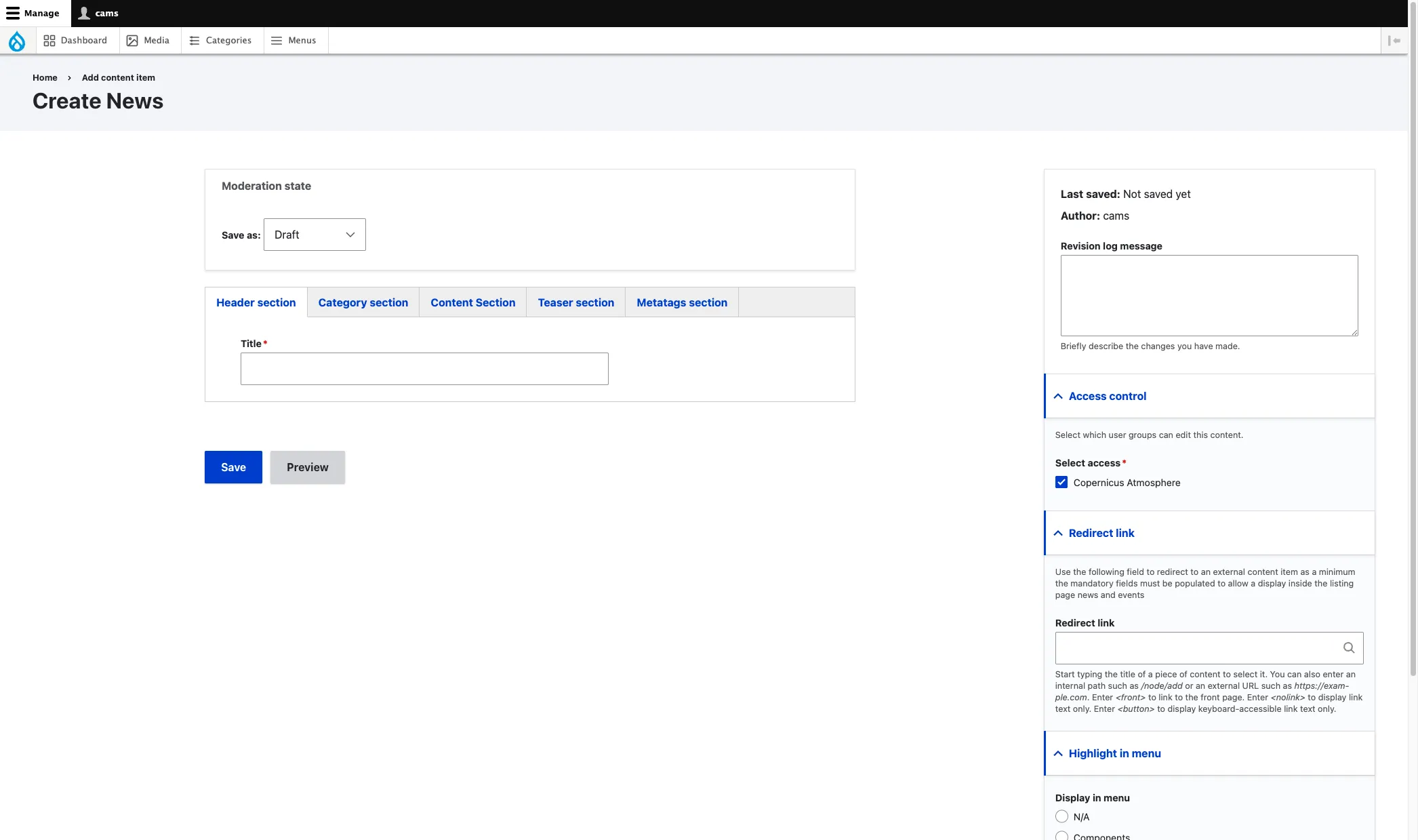
2. Header section
- Title (required) — the article headline. Drupal also uses it as the page’s internal name and as the basis for its URL.
3. Category section — taxonomies
- Component (required) — programme component.
- Service (optional) — pick the EU Space service this concerns. Drives the service-accent colour and the service-scoped listings.
- Sector (optional).
- News type (required) — press release, announcement, opinion piece, …
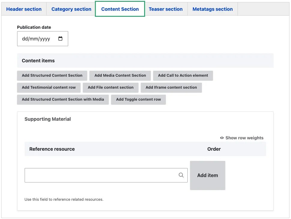
4. Content Section — the body
The Content section tab contains three areas:
Publication date — set the article date. This drives the chronological sort order in news listings.
Content items — build the article body by selecting Add to insert reusable content blocks. The available block types are:
- Structured Content Section — text content in a hierarchical, organised layout
- Media Content Section — image or video gallery displayed as a grid of tiles
- Call to Action Element — button or link directing visitors to a next step
- Testimonial Content Row — quote or endorsement with optional image
- File Content Section — downloadable file or list of files
- Iframe Content Section — embedded third-party tool or application
- Structured Content Section with Media — text content with an accompanying image, video, or iframe
- Toggle Content Row — collapsible accordion sections, suited for FAQs
You do not need to use every content block type. Choose only those that suit the article.
Reference resource — reference existing Resource content items (factsheets, reports, videos) that relate to the article. Start typing a resource title in the search field and select from the suggestions.
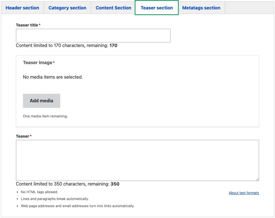
5. Teaser section
These fields drive how the page appears in listings and search results:
- Teaser title (required) — short title used on cards. Often the same as the page title; override only when the page title is too long for a card.
- Teaser image (required) — the card thumbnail. 16:9 minimum 1200×675.
- Teaser (required, plain text) — the short description shown under the title in cards.
6. Metatags section
Override the SEO defaults if needed. See Metadata options.
7. Sidebar
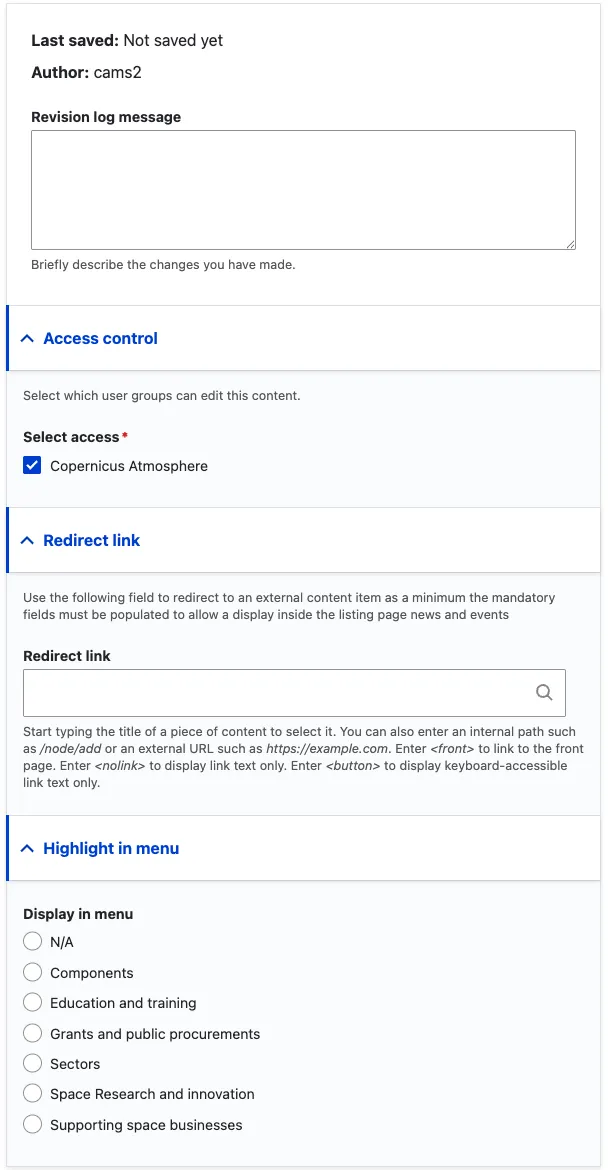
The sidebar on the right-hand side of the edit form contains the following fields:
-
Revision log message — briefly describe what you changed in this edit. This is visible in the revision history and helps other editors understand what was updated and why.
-
Access control (required) — select the organisation that owns this content. Only editors belonging to the selected organisation can edit or publish the page. In the example above, “Copernicus Atmosphere” is selected, meaning only CAMS editors can modify this article.
-
Redirect link — use this when the news item exists on an external site and you want the listing card to link there instead of rendering a page on eu-space. Enter an external URL or start typing an internal page title. When set, visitors who click the article in a news listing are taken directly to the linked destination. Leave empty for standard news articles hosted on the platform. The mandatory teaser fields (title, text, image) must still be filled so the card displays correctly in listings.
-
Highlight in menu — promotes the article into the mega-menu spotlight area under one of the main navigation sections. Select the relevant section (Components, Sectors, Education and Training, etc.) or leave as N/A. Use sparingly — this is for high-visibility editorial content that warrants homepage-level promotion.
8. Save and publish
Click Save. The page is saved as Draft. Use the Moderation state dropdown at the top of the form to move it through Needs Review → Published when ready (see Content workflow).
Common mistakes
- Title over ~110 characters. Wraps awkwardly on cards. Shorter title in Teaser title doesn’t fix it — the article page still uses the long Title.
- No teaser image. Required, but make sure it’s a good image — listings rotate articles, and a placeholder breaks the visual rhythm.
- Wrong Publication date. The listing sorts by this field. If you accidentally pick a future date the article shows up before the current week’s articles. If you backdate too far it disappears below older articles.
- Forgetting Service. Optional, but service-scoped listings and the service-accent colour both depend on it.
Tips
- For migrated articles, set Publication date to the original publication date — the “created” timestamp stays as the import day, but visitors and listings care about Publication date.
- Use Reference resource to add related downloads. The page displays them in a dedicated Related resources section, so you do not need to add separate Referenced Element blocks.
- For a service announcement, set both Service and News type = announcement — both feed targeted RSS feeds and listings.
News example
