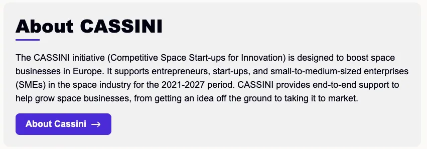
Highlighted content
version 0.1 Read time 1m 49s
Purpose
A Highlighted content row frames a single critical message — a summary, a key result, an announcement — in a visually emphasised block. It’s a “do not miss this” container. Each row holds one heading, one rich-text body, and an optional CTA. There are no nested items.
When to use
- The single most important takeaway of a long page (a conclusion at the bottom).
- An announcement banner inside an editorial article (“Registration is now open”).
- A key result summary on a use-case page (“40% faster response time”).
If you want multiple highlighted messages, do not add several Highlighted content rows in a row — the visual emphasis works only when it is the exception. Use one per page.
Steps
1. Add the content block
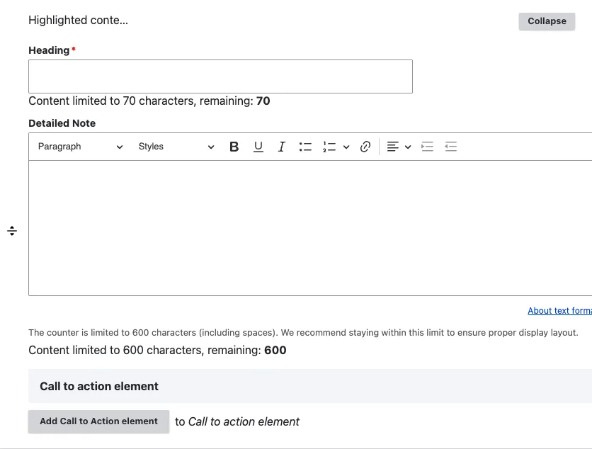
In Content items, click Add Highlighted content row.
A sub-form opens with three fields:
- Heading (optional) — the emphasis headline. Keep it punchy — a single sentence or fragment.
- Detailed Note (optional) — the rich-text body. Keep it short — two or three sentences. The visual frame already does the emphasis work; long text dilutes it.
- Call to action (optional) — adds a button at the bottom. The form offers Add Call to Action element — click it and fill the CTA sub-form (see Call to action). Use a Primary button here — Highlighted Content is exactly where a primary CTA earns its emphasis.
2. Save
Click Save on the page-editing form.
Field explanations
| Field | What editors should enter or select |
|---|---|
| Heading | A short headline stating the key message. |
| Detailed Note | Two or three concise sentences that explain the highlight. |
| Call to action | One optional follow-up button. See Call to action. |
Common mistakes
- Two Highlighted content rows per page. Breaks the visual hierarchy. Pick the single most important message.
- Long body. If the message needs three paragraphs, it’s not a highlight — it’s a section. Use Structured Content Section.
- No CTA. A highlight without a follow-up action is often a wasted frame. Either give the visitor something to do, or fold the text into a regular section.
Tips
- Use it for the conclusion of a long page rather than the introduction — the reader has accumulated context and is ready to be told “this is the takeaway”.
- Pair the heading with a numeric or factual punchline (“3 launches in 2025”). Vague headlines waste the emphasis.
Example
The following example presents one important message with a clear visual emphasis.